QUIET ,loud . These two words do not justify the meaning in this format. Quiet should be written in the small, neat style in contrast to the Loud which should be big and bold to signify the meaning.
 This poster of Uncle Sam for the U.S Army shows a good use of textual tone of voice. The colours of the poster are the same as the U.S flag and the letters are big and bold , with the YOU in the largest font backing up the point of uncle Sam's finger pointing.
 This image has an effective tone of voice to it as the writing 'Worth a closer look', is written in contrasting white, shows a girl with glasses looking very close at what could be a mirror. The writing backs up the picture.
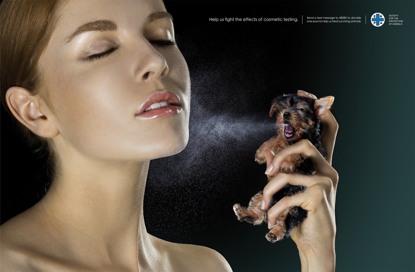
This advert is a campaign to show the effect of cosmetic testing on animals. In this adverts case its the image that has the tone of voice as the woman appears to be spraying perfume out of a dog that she is squeezing in pain. The writing is small and just about seen at the top to say what this is for but the main point is the disturbing image.
This is just an ordinary pet insurance claims form. It has a boring tone of voice because it is just in black and white in a standard grid formation and there is no colours involved it is boring and lifeless.

 This pet insurance form has a contrasting tone of voice. As it has colours and graphics because it is done on a computer. There is also a bulldog mascot for the company which makes the insurance appeal to people who love animals and it has an easier format to understand.


 This sign is an informative sign explaining to people that cctv is in use. It stands out using the contrasting colours of yellow and black to catch peoples eyes.
 This sign I would say is illegible as it is handmade and the words are drawn on with black pen. The sign is meant for drivers who are driving past but not only are there mistakes on the sign but it also has no way of catching onlookers attention as there is no colour.
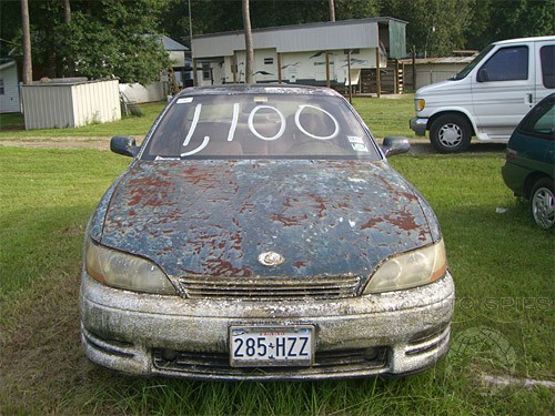
 This car that is advertised for sale has illegible writing on the front screen. The only attention that this car would get would be onlookers thinking how filthy it is. The white writing just looks like bird poo on the car and nothing more. A way to fix this problem would be to firstly wash the car and then get a bright sign maybe in yellow with printed black writing on it to catch peoples attention.

