Friday 6 January 2012

Image and text

Text with an image can help the viewer better understand what the image means! Adding text to an otherwise normal image makes the image have sense and suddenly becomes clearer for everyone to understand. Writing can be used to help the viewer understand the topic within the image or otherwise it may be used to tell the viewer the name of the subject or objects inside of the image.
This image is a photograph of a white cat lying on a brown carpet appearing to be touching with its paw some sort of orange glow. Without the text the viewer would not be able to admire it in the right context. With the text it brings a whole new funnier meaning, as it says 'This is what laser pointers are good for', this now makes the viewer imagine what is actually taking place and this is that possibly the cats's owner is playing with a laser pointing at the floor as a toy to amuse the cat so it can play. This is just one example of how text can change an image. 
This is another example of text making the image have humour. At first glance you see a little baby kissing a cute pig at a farm with a funny expression which seems completely innocent, when the text is added on it gives the image a less innocent and more adult context talking about how the 'Bacon not done yet' is the pig being to raw or 'alive' for the baby's liking. Having text on an image definitely can change the meaning of any image from funny or sad depending on the purpose of the creator.

Tuesday 3 January 2012

It is all about production!

FIRST EVER BOOK PRODUCED IN EUROPE: This was done by Johannes Gutenberg c. 1398 – February 3, 1468) he was a German man, who worked as a blacksmith, goldsmith, printer and publisher who probably introduced movable type to Europe, and is likely to have developed the earliest European printing press. He started the Printing Revolution,and this is regarded as the most important event of the modern period
The methods used for the printing and binding of books continued fundamentally unchanged from the 15th century into the early years of the 20th century. While there was more mechanization, Gutenberg would have had no difficulty in understanding the new and improved printers of the 1900's.
Gutenberg's invention was the use of movable metal types, assembled into words, lines, and pages and then printed by letterpress. In letterpress printing ink is spread onto the tops of raised metal type, and is transferred onto a sheet of paper which is pressed against the type. Between 1450 and 1455, Gutenberg printed several texts.
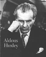
MY FAVOURITE VISUAL EXPERT IS: When I was younger my grandpa told me about Aldous Huxley who was a very highly regarded man. Becoming nearly blind in his teenage years as the result of an illness this set the stage for what would make him one of the most intellectual people to have ever explored visual communication.. When Huxley was 16 and a student at Eton, a terrible  eye  illness made him nearly blind. He recovered with enough vision to go on to Oxford  University and graduate with Honor's, but not enough to fight in World War I, an important experience for many of his friends, or to do the scientific work he had dreamed of which I believe was a big shame for him. Scientific ideas remained with him, however, and he used them in many of his books, particularly Brave New World. The idea of vision also remained important to him; his early novels contain scenes that seem ideal for motion pictures, and so in result he later became a screenwriter.
 He described "seeing" as being the sum of sensing, selecting, and perceiving. One of his most famous quotes is "The more you see, the more you know." I find Huxley a very impressive and revolutionary man as even though he was nearly blind he still managed to graduate university with Honours, and establish himself by visualising  in his mind the stories and screenplays he wrote. 

Saturday 12 November 2011

Tone of voice

The tone of voice in in images and text can effect how the audience respond to the information.
QUIET ,loud   . These two words do not justify the meaning in this format. Quiet should be written in the small, neat style in contrast to the Loud which should be big and bold to signify the meaning. This poster of Uncle Sam for the U.S Army shows a good use of textual tone of voice. The colours of the poster are the same as the U.S flag and the letters are big and bold , with the YOU in the largest font backing up the point of uncle Sam's finger pointing.
 This image has an effective tone of voice to it as the writing 'Worth a closer look', is written in contrasting white, shows a girl with glasses looking very close at what could be a mirror. The writing backs up the picture.
This advert is a campaign to show the effect of cosmetic testing on animals. In this adverts case its the image that has the tone of voice as the woman appears to be spraying perfume out of a dog that she is squeezing in pain. The writing is small and just about seen at the top to say what this is for but the main point is the disturbing image.

 This is just an ordinary  pet insurance claims form. It has a boring tone of voice because it is just in black and white in a standard grid formation and there is no colours involved it is boring and lifeless.


This pet insurance form has a contrasting tone of voice. As it has colours and graphics because it is done on a computer. There is also a bulldog mascot for the company which makes the insurance appeal to people who love animals and it has an easier format to understand.

Friday 28 October 2011

Research: LEGIBILITY


These particular signs are extremely legible due to the fact that they are used for emergency's. They are both created using bright colours to catch peoples attention and they use the rule of putting the contrast of the writing in white to the colour surrounding it so that the words stand out more.

This sign is legible as it is used for the purpose of advertising. Rolex the watch manufacturer have their crown symbol and green capital letters as their company face, so wherever people are they can recognise this is the Rolex brand. the sign stands out as it is lit up, big letters and contrasting colours of bright luminous green and a black outline make the words jump out at the audience.
 This sign is an informative sign explaining to people that cctv is in use. It stands out using the contrasting colours of yellow and black to catch peoples eyes.
 This sign I would say is illegible as it is handmade and the words are drawn on with black pen. The sign is meant for drivers who are driving past but not only are there mistakes on the sign but it also has no way of catching onlookers attention as there is no colour.
 This car that is advertised for sale has illegible writing on the front screen. The only attention that this car would get would be onlookers thinking how filthy it is. The white writing just looks like bird poo on the car and nothing more. A way to fix this problem would be to firstly wash the car and then get a bright sign maybe in yellow with printed black writing on it to catch peoples attention.
This map to me is extremely illegible as, firstly the writing is small and black and the colours used to show the routes are quite similar such as the pastel green and blue. The maps writing needs to get bigger and bolder using more visual colour to enhance it.

Sunday 23 October 2011

Connectivity

Notions of originality- Art is something that when first produced is someones first idea.  It seems fresh, new and this piece of work is the original. but then 20 or even a couple of hundred years later this original work has been copied, not in the exact same way but with a slight twist to convey the same message but through a small change maybe for advertising or just for fun to recycle the idea. Like the famous Andy Warhol image of Marilyn Monroe done in popart. This is such an influential image as it is known all through the world and in my life I must have seen about a billion copies of not just the same Marilyn but also Kate Moss or even Michael Jackson etc.. done in this way. I believe the idea of copying an original is a must have in the advertising world. I know from my experience that when I see an advert in a magazine that resembles an old, famous image, the advert instantly communicates to me as I look for the hidden message even if it's comic or a serious type.I find it interesting how even from a painting, 21st century artists can reproduce the image as a photograph in magazines such as Vogue to advertise the clothing. Sometimes the old painting can just trigger an idea for the new artist, for example 'Cottingley Faries' by Elsie Wright gave the idea for Matt Collieshaw's series 'Catching Faries'. The two images are not exact but the new idea bounces off the old one. Even documentational photography bases itself on old pictures for example,Jeff Wall- 'Dead troops don't talk' has a resembulance to Goya's 'Disaster of war' from the 1820's showing the effect of a devastating war. Without the original, the best advertising campaigns of this century would never have existed. I don't think of it as stealing an idea but more of manipulating it for a different purpose aswell as complimenting the original artist.

Wednesday 5 October 2011

managing a creative environment


 In order to achieve the best results, when working it is best to do it in conditions which are tidy, stable and comfortable. The workplace is vital in contributing to creative ideas and their development. When i'm on my own in my bedroom it is the best place for me to study and come up with ideas as it allows me to interact and broaden my mind. I will always do intense thinking in my room as I am used to the space and it feels comfortable for me to learn and get my best ideas into formation. In my bedroom there are many objects to inspire me like a big crystal paperweight which when in contact with the sun will project patterns of light all around the room, also my room has lots of pastel colours that interest me when i'm in deep thought so I don't get bored. I sit down on a comfortable chair and have a paper and pencil in my hand and then I can officially start my work I couldn't possibly work in an environment where it is messy with bits of paper everywhere , I enjoy simple, plain rooms where there is a desk to get working on and nothing to distract me (like the two examples on the left). Now that I am living away from home at university, my work environment is different and i guess it something I will have to get used too, but I am already in the process of making my space suitable for my working needs!

overcoming mindsets

In order for me to break out my creativity I have to overcome my mindset, not be thinking normally and rationally but OUTSIDE THE BOX. When I want to design something I imagine something that no one would expect, all people like the element of surprise, normal is so boring but being creative and intuitive leads to inspirational ideas that can change the world. if you get outside of your comfort zone your thoughts can progress into real life, there is nothing wrong with putting your own unique spin onto something as it becomes unique and in demand. Overcoming mindsets has happened for years as none of the great inventions we have today would have been around if it wasn't for crazy thinkers who used their wacky ideas to make (televisions. mobile phones, computers,electricity) the list is endless.
Three rules to overcoming your mindset:
1. Think about rules that you would like to break
and study their characteristics.
2. Find ways to challenge or change the rules by
questioning (What if ? Why not?)
3. Be playful and free yourself from conventions
and preconceptions. Avoid assumptions.
In order for your 'outside the box' ideas to succeed, research is needed to test the water to see if the idea fits into the world otherwise it could go wrong. For my groups magazine to be successful we as a group will have to overcome our mindset to think of new, interesting, creative  inotive ideas to publish in the magazine and make sure it fits in with the market it will be aimed at.